How to Pair Fonts in Ways that Just Work
June 3, 2022

A smile spread across my face as the words “seriously, YOU made this entire experience” rang in my ears. Months of memorizing infused oil and vinegar pairings had begun to pay off.
Many people would stop at the bakery just to try the new combinations that I would whip up for them as they made their way through the specialty store I worked at during my entire high school career.
At first, I had been nervous to start mixing flavors, but then I realized that I could listen to what people liked and quickly got a feel for what flavors I could combine for them to make their taste buds dance.
Pairing fonts can be overwhelming at first, but once you jump in, and start tasting and understanding the flavors, you can make magic.
So, before we go over the elements of a good font pairing, let’s get to know the flavors a bit and take a second to understand the importance typography plays in our everyday life.
The Importance Typography plays in our everyday life.
Stop for a second and take a look around you. Have you ever noticed how many words surround you?
I am writing this blog from my bed. When I look out into my bedroom I can see words on my pictures, books, games, stickers, water bottles, Austin’s deodorant, and guitar case. All without having to move. (Yes this room also doubles as our storage unit so we have a TON of stuff in here… but you get the point.)
Words impact us in so many different ways. The typography we choose goes a LONG way in getting that message across. Take a look at the image below. Both sentences are saying exactly the same thing, but you get two TOTALLY different messages from them.

Typography set the tone for the message you are trying to send and has the power to draw the viewer’s attention to the important parts of the message. If you aren’t sure what I mean take a look at this website. Pay attention to where your eyes are led. Notice there are hardly any images and the design is really simple… yet you are drawn through the website. Why? Because of the choice and variation of typography.
So before diving into practical tips about using differing typography correctly, let’s learn more about the font categories.
Let’s get to know the major font categories.
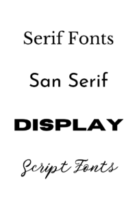
Serif Font- Serif fonts are the ones with the little feet on them. See the image below. These little feet can make them hard to read in blocks of text as the letters tend to blend together. But they make fantastic headers as they tend to be more timeless, bold, and attention-grabbing.
San Serif Fonts- San serif fonts are the ones that don’t have little feet on them. It’s easy to get confused. If you speak French, you’ll know that “san” means “without”. I speak Spanish, and “without” in Spanish is “sin”, which is very close. But even if you don’t speak these languages, hopefully, you can remember our little language lesson here today.
San Serif fonts are all-around great fonts to use. They are perfect for larger bodies of text but can also make awesome headlines. They can easily be more timeless or trendy and modern.
Display Fonts- Display fonts are literally made for headlines. No seriously… They are designed to be big, loud, and bold. They don’t look great when they’re small, as they can be hard to read.
Script Fonts- Script fonts are the more elegant fonts that are fantastic for accents. They can look more like a handwritten note or more old-fashioned.

Now that we have tasted the flavors of fonts available to us, let’s talk about how to pair them.
Pairing fonts together in a way that makes sense.
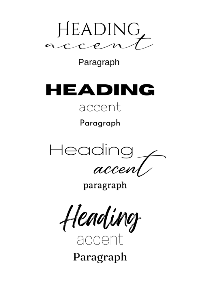
Combining fonts together is such an important part of the design. It creates interest and draws the viewer’s attention strategically to different parts of the design. With one font alone we can tell people exactly what to look at and in which order to look at them.
Our brains crave new stimuli. We quickly get bored of looking at the same thing or doing the same task for any amount of time. Using a variety of fonts is a simple way to avoid letting people get bored with your content.
Typography is such a powerful tool that, when used correctly, can be a total gamechanger. Let’s talk about the “rules” of mixing types because let’s be honest… There are some flavors that should never be put together.
- Use fonts that are contrasting.
Make sure the fonts you are pairing are very different from each other. If you use a bold serif font, try pairing it with a thin san serif.
When you pair two fonts that look similar the average person won’t know they aren’t the same font. But they will feel a disconnect. It will just look like you accidentally used a different font.
You want people to know you are using different fonts. It needs to look intentional. Using fonts that are varying in thickness, height and categories will instantly elevate your design.
- Never use more than three fonts in a design.
In design, there are a lot of rules you can break once you have mastered them. This is not one of them. Just don’t do it. Three fonts are plenty.
More than three fonts start to look cluttered and confusing. You are not going to be able to draw the viewer’s eye to where you want it if there are too many things to look at.
- Use fonts from different font categories.
Don’t be afraid to try weird things. You would be surprised at how nicely some fonts go together. My personal favorite pairing includes a Serif, San Serif, and a Script font. Take a look at this website we designed for Dena’s Dog Care. Notice how the fonts are very different. What feel do these different fonts give?
Some of my favorite designs however have come about by stretching myself to use a font outside of my comfort zone.
- Create Hierarchy.
Typically you are going to want to choose fonts of different thicknesses that will allow you to create a hierarchy- meaning you are showing the viewer what’s most important. You can use boldness, color, and the style of the type in order to do so.
Check out our services page. Take a moment to notice the parts of the copy that stand out. Why do they stand out? We were very intentional in how we used our three different fonts to pick and choose exactly what the viewers see when they land on this page.
- Use your font selection consistently in your design.
Once you decide which font is going to be the accent font, it needs to stay the accent. Don’t switch halfway through and make it the paragraph font. That is the quickest way to confuse your viewer.
Imagine looking at a design with a really clear header font design to really call your attention. Likely that was the first thing you saw. Then you start reading, and partway through the page, that header font is used in a normal paragraph. Instead of finishing the paragraph, your eyes are going to jump to the header font. You can’t help it. That’s what it was designed to do.
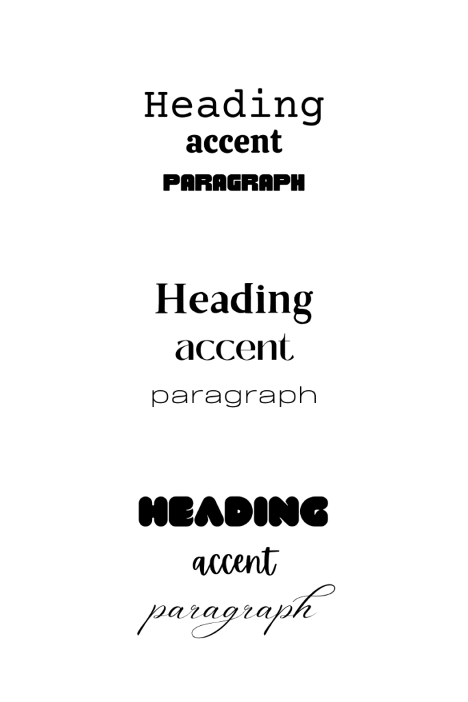
One of these images includes font paring that follows these rules. The other one does not. Take a second and see if you can spot all the rules that are followed and all the ones that were not. What works? What doesn’t?


Just like learning new oils and vinegar, it will take time for you to get good at font pairing and that’s OKAY! Imperfect action is always better than no action. Playing with fonts is SUCH a fun part of the design. Don’t be afraid to try new things. As you get good at pairing fonts, you will notice your overall designs seem to be much more sophisticated.
You can say a lot just with the typography you choose! Tag us in your designs, we would love to see what you create!